The best way to test tablets or smartphones in a browser
When developing mobile applications with Sencha Touch it is very unhandy if you have to grab constantly to your iPad to see if your latest modification work. I am developing on a Windows PC, so I don't have any of the tools that are available for Apple OS/X. So how can you keep your hands on your keyboard and still have a reasonable fair test suite?
Google Chrome
I am doing all my testing with the Google Chrome browser. I know that Firefox has the great Firebug plugin, but Chrome's developer tools do the job for me.
User-Agent Switcher for Chrome (extension)

To make your Chrome browser behave like an iPad you have to install the extension User-Agent Switcher for Chrome. This extension can change the user agent of your browser dynamically to a great selection of devices. It is also very interesting to have a look at the options of this plugin. A great feature is that you can add and modify the user agents that are configured. With the many changes in devices this makes this plugin very useful for future use. You can enter the options by right-click on the
 icon in the taskbar and select options. Another feature of this plugin is that it can act like other desktop browsers. But in that case I rather would use the actual browser installation.

Ripple (extension)
 Another great extension for Chrome to test websites for their responsiveness is Ripple. Install this plugin also. You gonna love it. It is since the beginning in a beta release, but I haven't found flaws that prevent me from using this wonderful plugin.
Now let's do the test
Now activate Ripple with the small  icon in the taskbar next to the URL. If you don't find it, maybe you should check your settings if the plugin is activated. Now a black screen shows up where on the left you can select your device on which you want to test. With the http://demo.mobiledetect.net/ link which we enter in our Chrome URL we can see the results.
As you can see, although we have the iPad selected, it is still thinking that it isn't a mobile device. Now we set the User-Agent Switcher to work.
Click on the

icon and select the User Agent you would like to simulate. We select IOS and iPad. The page will automatically reload and we get the following information.
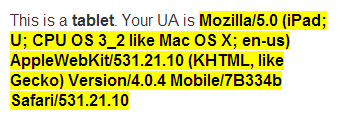
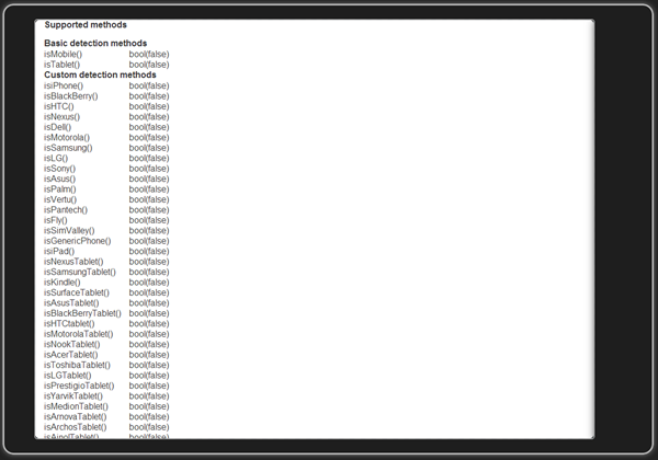
And the "iPad" now shows that it is a mobile device (isMobile) and a table (isTablet) and that it is an iPad (isiPad). Now you can test your mobile applications with your Google Chrome browser as it was real.

Switch off User-Agent Switcher and Ripple
After you are done with testing you might want to reset the plugin settings.
User-Agent Switcher
Click on the  icon in the taskbar. A list with browsers will popup and you can select Chrome and Default.
Ripple
If you don't disable Ripple it will remember the website where it was used and the next time you enter that URL, it will "ripple" the site again. So when you are still on the site which you have "rippled", click on the  icon and select disable. The page will reload automatically.
The techniques used will emulate mobile devices, it will never replace the actual device and gives no guarantees for equal results.
Links
List of mobile User Agents PHP Mobile browser detection (no flawless) Another PHP mobile browser detection (better)

Johan van de Merwe
More from same category

|
|

|
|

|
|

|
|

|
|

|
|

|
|

|